
Before digital platforms shaped how brands are discovered, compared, and remembered, businesses often depended on highly detailed logos to communicate trust, craftsmanship, and identity. Those logos made sense in a slower, more physical world. Today, the same visual approach often creates friction instead of clarity.
Do people instantly understand your brand, or do they have to pause and decode it?
Each of the examples below uses a classic emblem-style approach: decorative borders, ornamental details, tightly packed typography, multiple symbolic elements, and a storytelling-heavy composition. They are visually impressive, but they also reveal the core limitation of emblem logos in a modern brand system: too much is happening in one fixed mark.

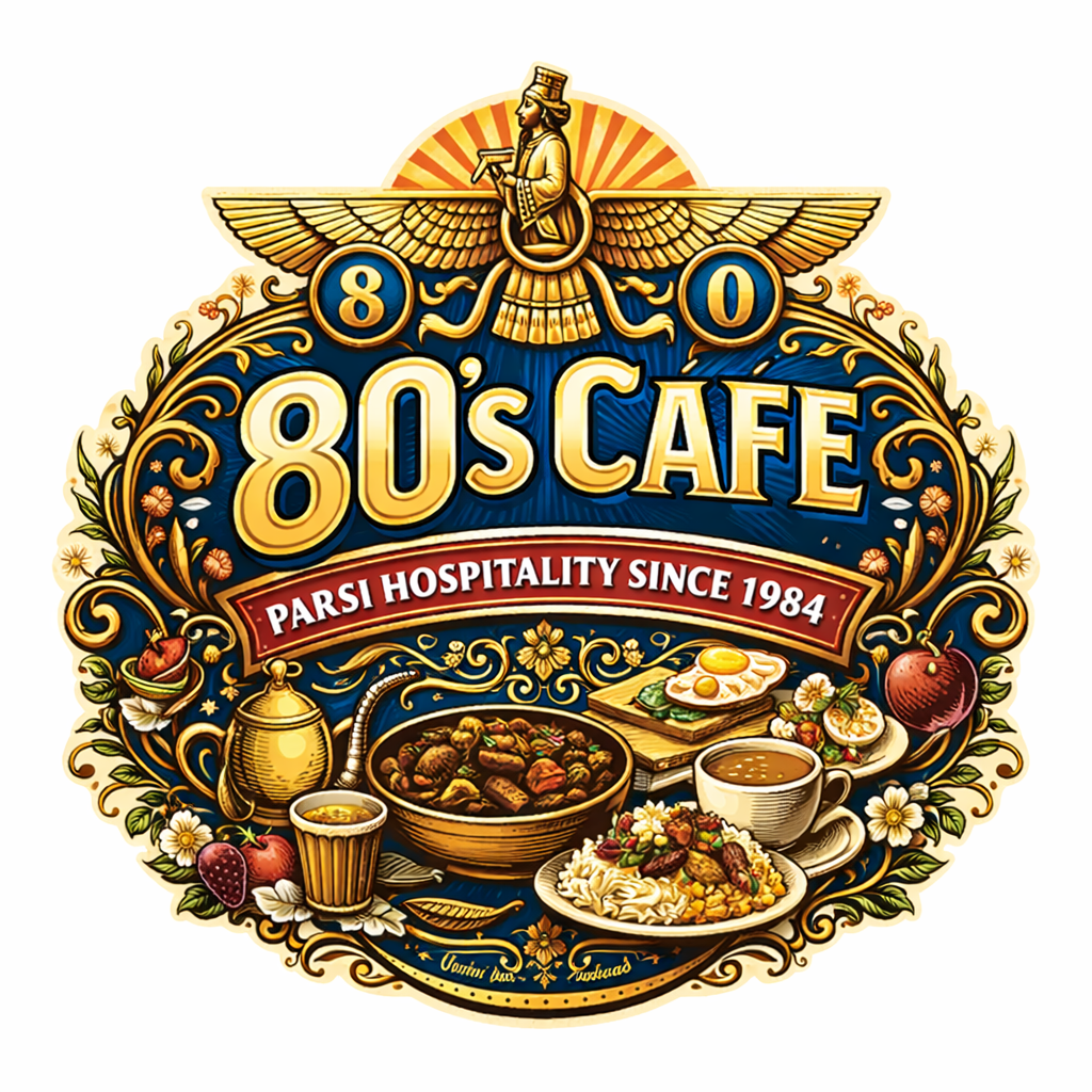
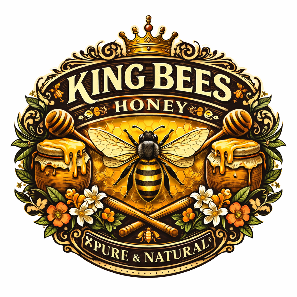
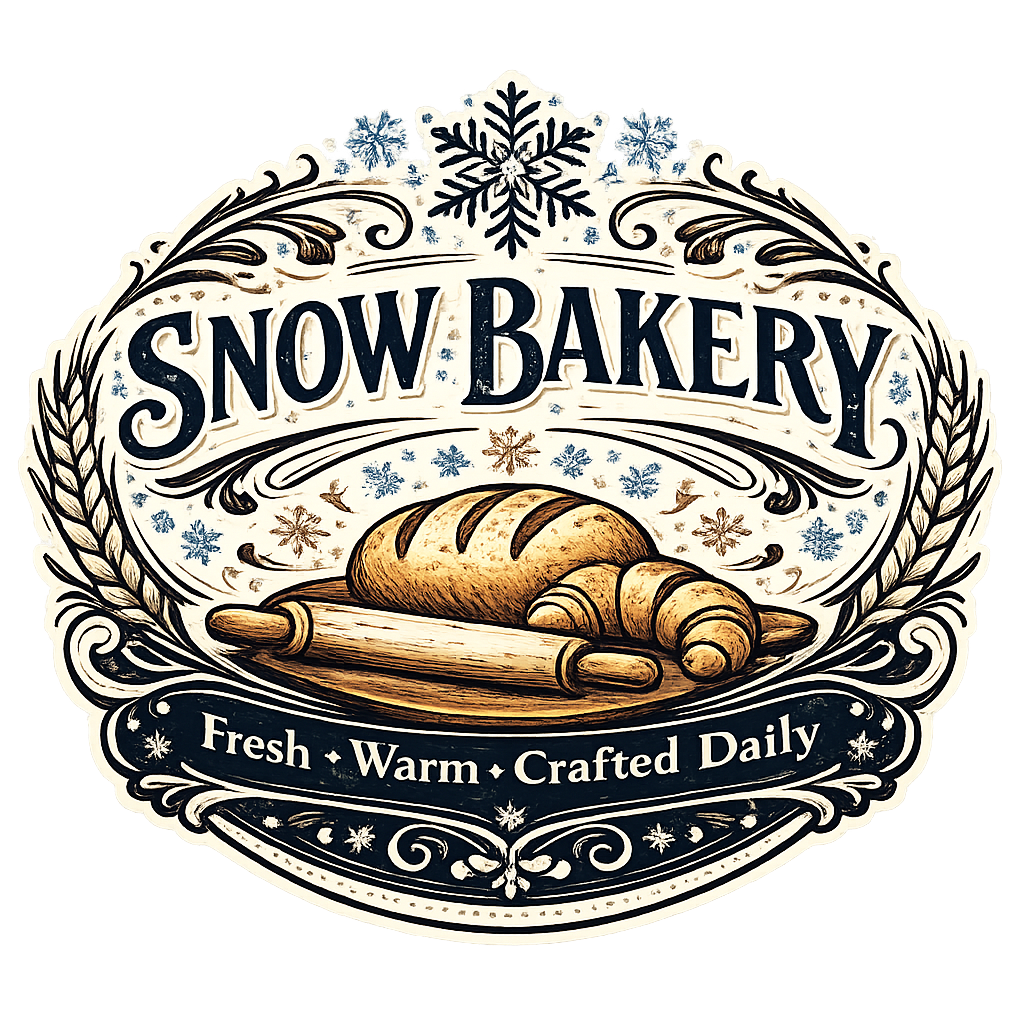
At first glance, these logos feel rich, premium, and expressive. But when a brand needs to appear on a mobile screen, inside a website header, on packaging, as a favicon, or inside a social profile image, that same richness can become visual overload.
An emblem logo is a logo style in which the brand name is integrated into a single enclosed visual composition. Instead of having a flexible symbol and a separate wordmark, an emblem typically locks everything together inside one badge, shield, crest, ribbon, circle, or decorative frame.
An emblem logo tries to say everything at once. That made sense when brands had fewer touchpoints. It becomes a problem when a brand needs to function across dozens of modern formats.
Emblem logos belong to an earlier branding mindset shaped by physical commerce. In markets, storefronts, packaging labels, metal signs, embroidered patches, and printed stationery, detail was often seen as proof of legitimacy. The more ornate a mark looked, the more established it felt.
More detail often meant more seriousness. More ornament meant more status. More symbolism meant more story. But branding today is evaluated under completely different conditions.
Modern branding is no longer judged only on beauty. It is judged on speed, clarity, adaptability, and consistency. A logo now needs to work on websites, profile images, packaging stickers, app icons, thumbnails, ads, invoices, labels, and more. This is where emblem logos begin to struggle.
Fine details disappear quickly when a logo is reduced in size. Decorative borders, thin lines, layered textures, and small lettering become unreadable on mobile screens and tiny placements like favicons or marketplace thumbnails.
Emblem logos are often built like static posters, not dynamic systems. They do not adapt gracefully to responsive layouts, narrow headers, circular social profile crops, or interface environments that require clean edges and visual simplicity.
Modern identity systems usually need multiple assets: a full logo, a short icon, a favicon, a social mark, a watermark, a packaging stamp, and sometimes an app symbol. Emblem logos are usually too rigid to break apart into useful components.
Today’s user does not study a logo the way someone might have studied a signboard in the past. People scroll quickly. They glance, judge, and move on. If a logo takes effort to interpret, brand recall becomes weaker.
Intricate detailing increases the risk of printing inconsistencies, especially on small labels, stamps, embroidery, low-cost packaging, and one-color applications. Simpler marks tend to be more durable and more economical across formats.
Modern logo systems are built less like illustrations and more like operating systems. They are designed to remain recognizable under pressure: smaller screens, faster decisions, more platforms, and more touchpoints.
Modern branding prioritizes clarity over ornament, recognition over decoration, and function over visual density. It is not about making a brand bland. It is about making a brand usable everywhere.
Not necessarily. Emblem-style artwork can still be beautiful and useful. The real issue is not whether an emblem is attractive. The issue is whether it is being used in the right role.
A business can keep the richness of emblem-style illustration as part of its visual world while still using a cleaner, stronger primary logo for everyday brand performance.
Emblem logos belong to a branding era shaped by slower attention, larger physical surfaces, and a stronger dependence on visual ornament to signal trust. Modern brands operate in a completely different environment. They need to be recognized faster, understood instantly, and applied consistently across many formats.
Clarity = Trust
Simplicity = Recall
Adaptability = Growth