
A logo is not “just a design.” It is a repeatable visual identity system. Different logo types exist because brands appear in different contexts—website headers, packaging, invoices, mobile icons, social media, signage, and product labels. Below are the most common logo types, with clear use-cases and examples.
Quick rule: Strong brands don’t rely on one logo. They use a small family—wordmark, letter/monogram, icon, and a combination lockup—so identity stays consistent everywhere.
A wordmark uses the full brand name as the logo. It relies on typography, spacing, and proportions. This is the fastest way to build name recall—especially when the brand is new and trust must be earned quickly.
A lettermark uses the initials instead of the full brand name. This is useful when the business name is long, technical, or hard to pronounce. The design must remain readable at small sizes because lettermarks are often used as icons.
A monogram is a stylized set of initials (often woven into a single mark). While it looks similar to a lettermark, it typically leans more premium and “crafted,” making it common for fashion, luxury goods, premium packaging, and signature-style branding.
A pictorial mark is a recognizable object or image used as the logo. It’s easier for people to remember because the brain encodes pictures faster than text. Pictorial logos work well when you want strong recall in icons, packaging, and social profiles.
An abstract mark is a symbol that doesn’t literally represent a real object. Instead, it represents an idea—speed, connection, motion, protection, balance, or progress. This gives you a unique “ownable” shape that can become a powerful brand asset over time.
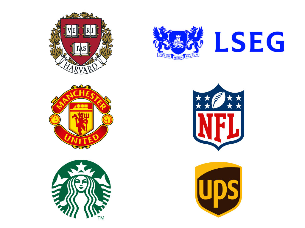
An emblem places the brand name and/or symbol inside a contained shape (badge, seal, crest). Emblems feel established and “official,” making them common in legacy brands, institutions, premium products, and community-driven organizations.
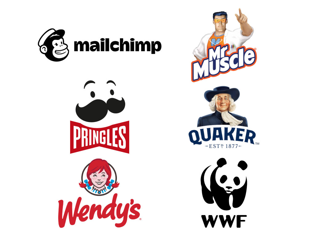
A mascot logo uses a character as the brand anchor. Mascots build emotion and familiarity, making them powerful for storytelling, campaigns, and social-first brands. A mascot can become a recognizable “face” of the business.
A combination mark uses both a symbol and the brand name together (a “lockup”). This is one of the most practical formats for early-stage brands because it builds recognition for the name and the icon at the same time—so you can later separate them confidently.
If you want a clean modern identity system, build a small “logo family” instead of one logo: (1) Wordmark for trust, (2) Icon/Pictorial or Abstract for tiny placements, and (3) Combination for flexible everyday use. Add Monogram/Lettermark if you need a premium stamp-style identity, and use Emblem/Mascot only when it matches your category and marketing style.
Key result: Your brand stays recognizable even when the context changes—mobile, print, exports, packaging, or social media.